Friday, 24 February 2012

Potential front cover poses


Warped TourWarped Tour
I came across these shots by looking through the pictures of SUM41's tours on their official website. Theses were captured during their performance in summer 2010 and I feel these are typical rock-star poses that I can use for my Music magazine front cover as it will appeal to my target audience.

Wednesday, 22 February 2012

Practice shots for my magazine

I finally get to take the camera out and take 'practice pictures' of what general poses I want to use in my music magazine. I got assigned a camera and practiced a few shots around school to get used to the camera before actually taking my practice shots. Thanks to my amazing model Cleo Greer I managed to get great shots and I was pleased with the outcomes, however the jump shots did blur a bit. To avoid this I will be taking multiple shots at once so there is more chance of getting a picture that isn't blurred. When taking the final photos, I will be capturing the shots behind a white background so that it will be easier to photoshop it into my magazine.

-Here are the shots I have taken today:

 1. This is an idea of what pose my front cover might have.
 2. This is another pose my front cover might have.
3. This is a pose my double page spread might have (on the side of the page).

Tuesday, 21 February 2012

Music Magazine - Potential Masthead Fonts

I have been testing out different fonts that I can use as the masthead on my magazine front cover and I have come up with a list of different ones which could work well with the Alternative rock theme of my magazine.


These are the fonts that I have collected and I will ask people's opinions on which they would prefer or expect to see on an alternative rock music magazine and why, I might do this by means of creating a survey and/or asking people who are in my media lesson.
______________________________________
UPDATE!

Many people have said that the third font works best, however I disagree with this as it gives an impression of metal music which is not the genre of my magazine. I have chosen to go with the second one as it is very big and bold which allows me to alter and edit it to my preference.

Potential front cover pose

         
This is a shot of Deryck Jason Whibley performing, he is part of the band SUM41 and is the lead vocalists & guitarist. I think this could be another potential shot for my front cover of my magazine; his facial expression shows that he is singing loudly which is typical of my target audience (people who listen to Alternative rock) so therefore it would appeal to my target audience as the semiotics of his electric guitar, spiky hair and facial expressions all show a relation to the loud and rebellious Rock/Alternative rock genre.                                                                       

Monday, 20 February 2012

Potential front cover pose

One of my FAVORITE songs when i was a kid; SUM41 - 'In too deep'
It was also played in an American television series called 'Malcolm in the Middle' (another thing i loved as a kid... still do) But getting towards my main point is that I was watching the music video and came across this pose and automatically thought it would make a great pose for my model in my music magazine.
I think this pose can appeal to my target audience because it is related to alternative rock with the facial expressions, guitar strap and the mic.

Sunday, 19 February 2012

Music Magazine - Potential Name

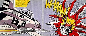
'WHAM!' I believe should be a suitable name for my music magazine. Alternative music is known to be loud and  in this genre it is very known for breaking guitars and wrecking havoc, so I thought it would be a good idea to use this and come up with a 'loud' name for my magazine. I researched into Roy Lichtenstein (world famous pop art artist) who used onomatopoeia in many of his paintings as they were comics of action; crashes and explosions. I decided to use some of his paintings for inspiration. Here is an example of one of his works:                

Music Magazine - Shot List

SHOT#1: potential front cover pose, a close up of my artist's face to show that she is going to be the main feature of the magazine in the double page spread.
SHOT#2: Double page spread, using a long shot i wanted to have a picture of the artist lying down with a guitar resting of her shoulder as this shows she is an artist in music and it also leaves a lot of space for text. However I might not use this idea as it is used by many people and I want my double page spread to be different from others as the alternative rock genre is very different.
SHOT#3: Extreme long shot of people on a stage, I want to use this in my contents page as it could show people preparing for a gig or an upcoming concert. I found this common in the rock magazine "Kerrang!"

SHOT#4: Long jumping shot in order to get all of the body's actions. This jump is seen in many alternative rock concerts and gigs which is why I have used it in order to relate to my genre and target audience.
SHOT#5: I got this shot from a music video by "The Offspring" (Alternative rock band) I find this shot effective as the artist's head is up close and it makes them stand out on the front cover.
SHOT#6: long shot with an electrcal guitar, the guitar gives a rock connotation and the pose the model is doing looks like she is performing.