
Thursday, 16 February 2012
Front cover potential action shot
So I was watching a music video of 'The Offspring' and I came across this pose in the middle of the video and thought it could be an idea for a pose for the model for the front cover of my alternative rock music magazine. The shot used is a mid-long shot, in order to get most of his body into the camera frame, the guy's head is also slightly sticking out making his face the centre of attention in this shot which I feel is very effective in catching people's attention. I would also use the 'tough' expression on his face as it can be a semiotic; it anchors the alternative rock theme/genre.


Monday, 6 February 2012
Double page spread - Research
Presentational | Visual |
· Font | · Pull quotes |
· Colour scheme | · Semiotics |
· Size | · Alliteration |
· Layout | · Rhetorical question |
· Headline | · Slang |
· Pictures/Photos | · Grammatical error |
· Pose | |
· Camera shot | |
· Angle of gaze | |
· Expression | |
· Mise en scene | |
· Contrast? |
Wednesday, 1 February 2012
Semiotics - Kerrang

In this issue of Kerrang magazine, it features Green Day on the front cover. As you can see their faces show an expression of shock, surprise, scared, aggressive and something new possibly. This can suggest that they possibly have a new rock album coming out or they have a shocking secret they have exposed. This is apparent in the pull quote under the title Green Day; "We've made the album of our lives". This shows that they are showing through their facial expressions that they actually DO have some exclusive news; their new rock album.
They are showing their eyes really wide open, by this we can tell that their eyes are relatively green which related to their band name; Green Day. They also made the colour scheme black, white and red which is a typical colour scheme of a rock/alternative rock magazine. The band is also wearing black, the band member on the left is wearing a black, white and red tie which also links to rock and the colour scheme of the magazine.
Sunday, 29 January 2012
Survey Research
I have learned about the advantages and disadvantages of a number of ways to gather information by research. The purpose of research is to gain information as to what pleases the audience of my magazine and what attracts them to it.
There are two types of data:
There are two types of data:
- Quantitative: Type of research which uses numbers for data and statistics to analyse results.
- Qualitative: Method of inquiry appropriated to understand how people think about specific subjects.
For my research for my magazine I will be using Quantitative research as this is an easy way of gathering and analyzing data, despite having relatively closed questions. Therefore I will be using a questionnaire, here are the advantages and disadvantages of using one so i can balance out the cons and pros:
Advantages:
- Produces large amount of standardized data.
- Data can be collected quickly and conveniently.
- Replicable and easy to analyze.
- New types of research can be suggested.
Disadvantages:
- Lacks Flexibility
- Biased level of motivation
- May be a biased questionnaire
- Boredom of participants.
For my questionnaire I have considered the following questions to find out how my magazine will appeal to my target audience:
- Where do you buy your music from?
- How often do you buy magazines?
- What would attract you to a magazine on a shelf?
- What genre of magazines do you read?
- What interests you most about the magazine you read?
- How much would you usually pay for a magazine?
- What colours work best for an alternative rock magazine?
- Who would you like to be featured on the front cover?
- What would put you off buying the magazine?
Monday, 23 January 2012
Alternative Rock - Magazine Cover Layout


Both:
Target audience: Rock/Alternative fans. Target audience are usually young people like teenagers and young adults. This is exposed by the main cover image which always shows young adults who are in a rock/alternative band. Also the younger generation listen to this Genre so mostly young people buy it.
Masthead: White and Black or Red. Big and bold which catches your eye (stands out).
Colour scheme: Both have a recurring colour scheme of Black, White and Red which is also apparent in many album covers, such as My Chemical Romance (As shown in my earlier post on Monday 23rd Jan 2012).
KERRANG!:
Puffs: The words 'FREE' and 'PLUS' are in a larger font which attract the reader because the word 'free' makes the reader think this magazine comes with an extra benefit. The word 'Plus' makes the reader believe there are so many exclusive extras in the magazine which encourages them to buy it.
Main cover line: "My Chemical Romance" is used because the cover image has got the band on it. The font is red which stands out from the colour black and white which is typical of an alternative rock theme.
Cover image: The cover image of this issue of the magazine is 'My Chemical Romance', this band is very popular and well known among teenagers (young audience) so this attracts their target audience. A high angle shot has been used in order to get a full view of their face (so they are easily recognizable) and what they are wearing (black) which links to the colour scheme of the magazine.
Typeface: Sans serif.
Layout: Kerrang has a busy layout with images and text crowded at the bottom of the page. The main image of the band has been made into a separate layer which covers the masthead in order for the band to stand out.
BigCheese:
Puffs and Plugs: "30 GREATEST POP-PUNK ANTHEMS" is a Plug; it makes you want to see the greatest thirty anthems.The list of artists/bands: "Biffy Clyro, 30 Seconds to Mars, Killswitch Engage, Every Time I Die, Dead By Sunrise, In Flames, Bowling For Soup" is a plug used which can be very effective because there is a high chance that a reader sees a band/artist they are a fan of which encourages them to buy the magazine as they believe they will be featured.
Cover line: 'Paramore get the kiss of life', this gives the reader a hint of what is to come inside the article.
Pull Quote: "We had to revive the band", by using this quote from an article on the front cover makes the reader question "why?" and makes it seem dramatic which makes the reader want to buy the magazine so they can find out what happened.
Typeface: The masthead uses serif font, whereas the rest of the writing on the front cover is sans serif and script.
Layout: The layout for BigCheese is similar to Kerrang!; BigCheese also has the main image infront of the text. Its also quite busy at the bottom of the page but with text instead of pictures. The colour scheme is similar to Kerrang as well; Black, White and Red. However the background is green with fades of white throughout. The pull quote and the cover line have got a large shadow behind the text making the title 'Paramore' stand out from it (as it has a white outline to the red text used as well).
My Music Magazine - (planning)
For my music magazine I will probably have an alternative rock genre, as some of my favorite bands play that sort of music, such as Green Day, Muse, Good Charlotte, Sum 41 and Alien Ant Farm. A magazine that features this genre is 'KERRANG', although they are devoted to rock music, punk rock bands and alternative rock bands have been featured on their front cover such as 'My Chemical Romance'.
 For my colour scheme, I will use white, black and red as these colours relate to many album covers of alternative rock bands and also make it appealing to my target audience (teenagers).
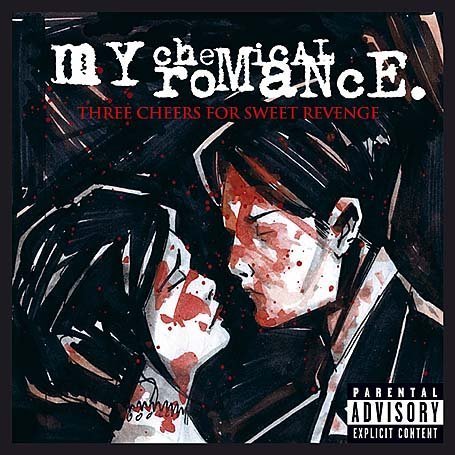 For my colour scheme, I will use white, black and red as these colours relate to many album covers of alternative rock bands and also make it appealing to my target audience (teenagers).
The cost of my magazine will be around £2.50, during production we will focus on making the magazine more appealing to the target audience which is why the colour scheme and layout is important for me.
The articles in my magazine will include the topics of:
Upcoming gigs,
Upcoming artists/bands,
Album releases,
Talk about different rock bands.
My magazine will be distributed by a compant that works closely with music retailers, such as HMV. However we will also work to have a shelf space in smaller independent retail shops as alternative rock isn't as popular worldwide as 'Hip hop' or 'Rap'.
There will be an online version of the latest articles featuring well known bands in the genre and interviews with them. The online version will be the same as the printed version, but it will also have a feature to have a copy of the magazine ordered to their adress whenever a new copy is printed.
Friday, 20 January 2012
 The New Musical Express (better known as the NME) is a popular music publication in the United Kingdom, published weekly since March 1952. It started as a music newspaper, and gradually moved toward a magazine format during the 1980s, changing from newsprint in 1998. It was the first British paper to include a singles chart, in the 14 November 1952 edition. In the 1970s it became the best-selling British music newspaper. During the period 1972 to 1976 it was particularly associated with gonzo journalism, then became closely associated with punk rock through the writing of Tony Parsons and Julie Burchill.
NME is a British weekly music magazine. Featuring agenda-setting news, the UK's most comprehensive gig guide, definitive reviews of the week's hottest gigs, tracks and
Subscribe to:
Posts (Atom)